Infographics
Balance was one of the more difficult principles to convey in
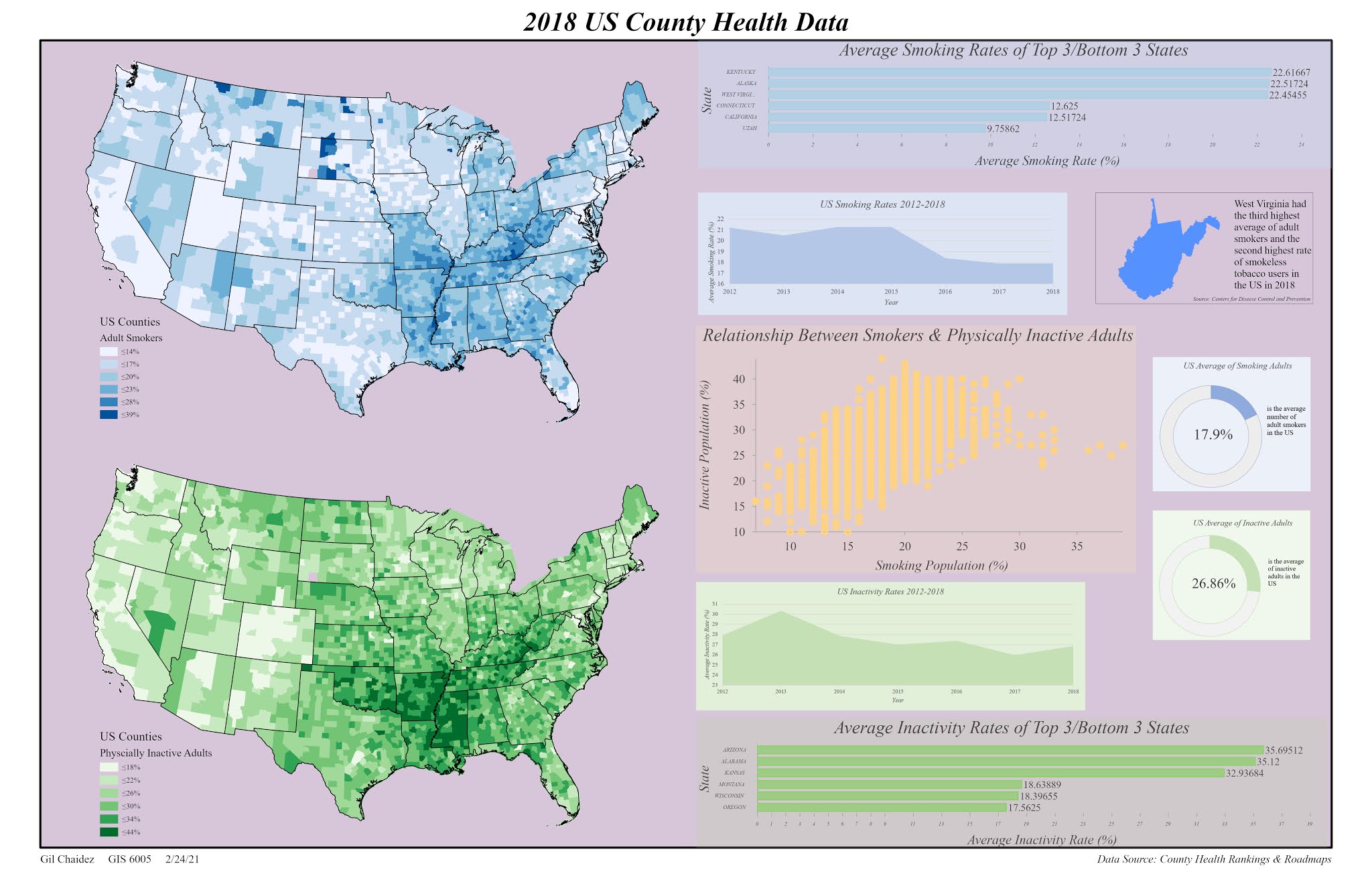
this assignment. This was a lot of information
in the form of boundaries, charts, and graphics that did not fit easily
together. I constantly was having to resize
the charts made in Excel to get them to match one another, one huge drawback of
not being able to make all of my charts in ArcGIS Pro. For legibility, I used a 11”x17” landscape layout
to avoid font sizes going below 5pt. I
used a background color for the layout to try and hide the fact that this is
several elements all spaced apart from one another. With the background color not being white,
the idea was to have the map reader “flow” from one chart to the next without acknowledging
the empty space between them. For better
contrast, I included slightly-transparent backgrounds to these elements against
a colored layout.
I chose two stacked area charts to represent the average
inactivity and smoking rates from 2012-2018.
I didn’t want to include another bar graph considering I used two for
the top three/bottom three states in these categories, and I thought a stacked
area chart would provide better visibility than a line graph. I chose not to include data labels as I’m
only trying to show a general trend (or lack thereof) over the recent years in
each category. I again used slightly
transparent colors for the backgrounds of these images to draw attention to the
chart area without washing out the stacked area.
I also included a small fact about West Virginia in the general
area of the smoking information on this infographic. I extracted only the boundary of West Virginia
from the states shapefile and boxed it into a rectangular neat line to distinguish
this fact from the rest of the adjacent information. Its source was also included in the neat line
to again distinguish it from the listed source for the rest of the infographic.
With the Excel file, I used the AVERAGEIF function in
new columns to sort out the average smoking and inactivity rates of the states
quickly. Once these were calculated, I sorted
these lists from largest to smallest and deleted all rows except the first and
last three. I saved two separate files,
one for the smoking averages and one for the inactivity averages. I used Time New Roman for all font (just like
the scatterplot) but had reduce the font size of the axis labels to 5-pt to
line up next to the bars properly. I
used data labels but did not find a way to reduce the sigfigs to two digits. I removed the grid lines as they became
overwhelming even with a small line weight, and for contrast, used a similar
color for each chart relative to their associated choropleth maps and increased
the transparency of the backgrounds to 80%.


Comments
Post a Comment